“There is no time for cut-and-dried monotony. There is time for work. And time for love. That leaves no other time.”
― Coco Chanel
-------CRITIQUES OF MY DRAWINGS-------
|
August 22nd, 2014
Title: "Cougar" Describe it in a few sentences. This was a drawing of my younger cat, Cougar. He was falling asleep on the floor under a table, but I didn’t want to draw the chair legs so ended up I adding in the couch and blanket under him so I could have a better background. How did you use the elements and principles of art? Explain where you include them. I shaded the cat, blanket , and couch, showed a lot of lines through the fur, and had Cougar emphasized by putting him in the center and having him the most detailed. Also, his fur was black and white so it was easy for me to include contrast. Where and when did you do this? I drew this at home on Thursday during the evening. What is the most original or creative part? I think the most original part was the couch and blanket because I had to kind of guess how the couch and blanket would look like with a cat sleeping on it. Why did you choose this particular theme? I was feeling sleepy, so I saw my cat doing what I wanted to do and decided to draw what I felt at that time. What do you like best and what do you like least? Why. I like how I drew the form of my cat because it looked realistic but I didn’t like the fur because it doesn’t look very realistic and felt too choppy. What else should we know about this piece. The more information you provide, the better! The couch and blanket were out of my imagination so that’s why they don’t look very good! |

|
|
August 29th, 2014
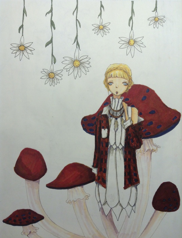
Title: "Unpredictable Nature" Describe it in a few sentences. It’s a really weird abstract piece that was kind of put together in fragments. The mushrooms are like the plaid shirt and the hanging daisies are like the dress. I made the girl blonde to make it look like the middle yellow part of a daisy. How did you use the elements and principles of art? Explain where you include them. I colored my work and made form from the girl, daisies, and mushrooms, I used texture by making the clothing, flowers, and mushrooms smooth and not choppy and shred-like, and balance was used because the right side is more dense than the left side. Where and when did you do this? I drew the girl and daisies last weekend throughout the day. I colored and detailed them on Monday and Tuesday. On Wednesday and Thursday I decided to add mushrooms (I don’t know why, it looked better in my mind). What is the most original or creative part? I think the most creative part were the hanging daisies because they weren’t just standing up from the bottom of the page like normal flowers. Why did you choose this particular theme? I honestly don’t know. The outfit came to my mind first and I branched out from that to the daisies and mushrooms. What do you like best and what do you like least? Why. I like the outfit the best because it was an original design that I really like. I don’t like the mushrooms because they were kind of like last second add ins and were not colored well at all. |
|
September 5th, 2014
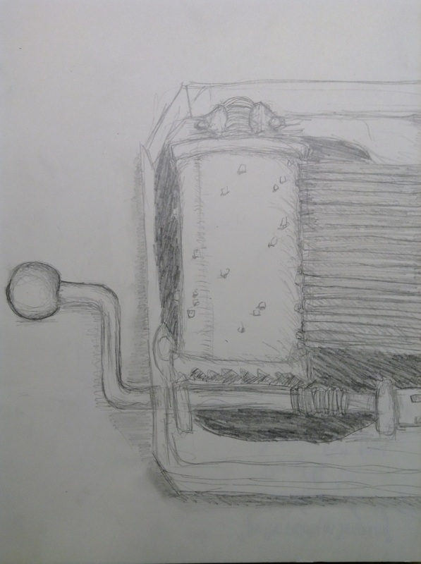
Title: “The Complexity in Simplicity” Describe it in a few sentences. This was a pencil drawing of a music box I had in my bedroom. It’s a zoomed up view of the box and I cut the box in half. I drew they music box really big because I thought the mechanics of it were really interesting. How did you use the elements and principles of art? Explain where you include them. I used repetition in the thing that plucks out the sounds, forms in the cylinder thing and handle by shading, contrasting background in the music box case, Where and when did you do this? I drew this during the labor day weekend, and I found this music box in my bedroom. What is the most original or creative part? I think the most creative part was zooming up and cutting the box in half because it makes it more interesting and makes you think what is for a second rather than just having the whole box in the middle of the page. Why did you choose this particular theme? I chose this theme because it is a complex machine that made simple yet beautiful music, and I really liked that concept. What do you like best and what do you like least? Why. I liked that cylinder the best because it was my favorite to draw since I thought it was really cool how someone thought up of that. I didn’t like drawing the metal bars because it was hard to make the bars look straight and even. What else should we know about this piece. The more information you provide, the better! The metal plucky bar thing to the right are what sounds when they hit the bumps in the cylinder. The handle turns the cylinder and as it turns the bumps pluck the metal bars, making different pitches for each bar. |
|
|
September 12th, 2014
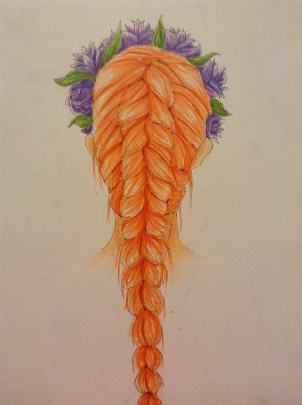
Title: "Bold Colors" Describe it in a few sentences. It’s a drawing of the back of my head with my hair french braided. Obviously I changed the color of my hair in my drawing to reddish orange. I also added in a flower crown to make it look more interesting. How did you use the elements and principles of art? Explain where you include them. I used secondary colors(green and purple) for the flower crown and an intermediate color for the hair(red-orange), I outlined, used value in the hari especially, movement from the hair to move your eyes down the the page, and rhythm in the braid. Where and when did you do this? I drew this on Sunday and colored it through the week. What is the most original or creative part? I think the most original part was changing the hair color to this sharp fiery shade of orange because I never really colored hair that color before and it looked really pretty. Why did you choose this particular theme? I don’t really know. I just felt like drawing and coloring this; it was a random imagination that i wanted to create. What do you like best and what do you like least? Why. I like the hair the best because it looks realistic and smooth. I didn’t like the flower crown because it didn’t look like the way I wanted to and the flowers and the coloring of it don’t look good. What else should we know about this piece. The more information you provide, the better! The little orange spots weren’t intentional because I was using an orange copic marker and the ink sometimes flung out onto the paper whenever I took of the cap of the marker. |
|
September 19th, 2014
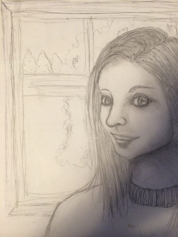
Title: "Hallie" Describe it in a few sentences. This is a drawing of one of my best friends, Hallie. It’s a realistic(or as realistic as it can be) drawing of her, and I wanted to try this style out since I never really done it before. I just used a pencil and my finger for the smudging on this. How did you use the elements and principles of art? Explain where you include them. I used value for the shading, contrast between her hair and skin, some texture in her hair and skin, lines for hair and outlining, organic shapes for the nose, mouth and eyes, but the pupils are geometric shapes. Where and when did you do this? I drew this during the weekend when I was hanging out with Hallie. What is the most original or creative part? I think the most original part was putting her to the side of the paper instead of just right in the middle. Why did you choose this particular theme? I felt like I really needed to practice my horrible realistic drawing skills and try to do draw something different this time. What do you like best and what do you like least? Why. I liked the eyes because they look really pretty and sort of realistic but I didn’t like the hair or shading at all because it looks bad. What else should we know about this piece. The more information you provide, the better! There was not a good light source so it was kind of hard to tell which part to shade. This is definitely not one of my best works. |
|
|
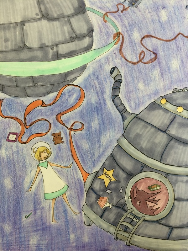
September 26th, 2014
Title: “So What’s Your Plan After This?” Describe it in a few sentences. This drawing is on another planet or in another dimension where it’s all made out of metal and advanced in technology. The outcasts are sent out in these capsules like the girl in the drawing. She breaks free from the capsule to run away from her corrupt society. How did you use the elements and principles of art? Explain where you include them. I used emphasis on the girl’s capsule and herself by using thicker lines on the capsule and coloring the girl and her items bright colors, contrast with the darkish space color vs. the girl, her items and the orange cords, value with the metal, and space with the space(haha). Where and when did you do this? I drew this on Sunday and colored it throughout the week. What is the most original or creative part? I think the most original part to the piece was the design of the machine and the background story. Why did you choose this particular theme? I just needed a break from making real life observational drawings because non-observational drawing is more fun! What do you like best and what do you like least? Why. I like the capsules the best because they look cute and unique. I didn’t like my colored pencil coloring for the space background because it didn’t turn out as clean as I thought it would turn out. What else should we know about this piece. The more information you provide, the better! Pretend that she won’t explode in space from not wearing a spacesuit and don’t think too logically when looking at this because it’s not realistic. At all. The title is just a rhetorical question to the girl; I don’t know, I just felt like putting that as the title for some reason. |
|
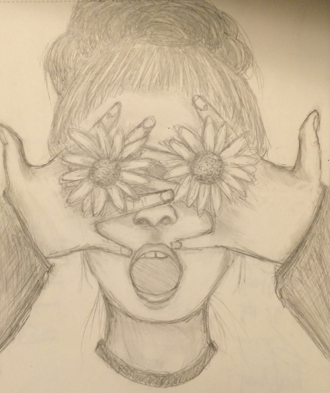
October 3rd, 2014
Title: “What can you see now?” Describe it in a few sentences. This is a pencil drawing of me covering my eyes with flowers. The flowers are attached to small hair ties that I could wear as rings on my fingers. I just thought this idea would be fun and unique. How did you use the elements and principles of art? Explain where you include them. I used contrast by shading and value, contour lines, movement lines in hair and flowers, balance with the hands,and texture for the most part. Where and when did you do this? I drew this on Sunday in my room. What is the most original or creative part? I think the most original part was the idea of replacing my eyes with sunflowers. Why did you choose this particular theme? I just thought it was a fun and weird thing to draw. What do you like best and what do you like least? Why. I liked the sunflowers the best because the placement is interesting and are the most well drawn thing in this piece but I didn’t like how I shaded the skin because it doesn’t look realistic, same goes for the hands. What else should we know about this piece. The more information you provide, the better! This drawing doesn’t really have any deep meaning to it, it’s mainly just for fun. But I guess you could say that the flowers represent nature and through my eyes I see beautiful things because I love nature. |
|
|
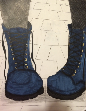
October 8th, 2014
Title: "Bold" Describe it in a few sentences. This is a drawing of my combat boots. It’s a zoomed up view of them. I changed the color of them to a navy blue rather than black. How did you use the elements and principles of art? Explain where you include them. I used shading and values in the boots, colored it , emphasis on the combat boots, lines from the background, and positive space and negative space. Where and when did you do this? I drew this on Sunday but colored it on Wednesday. What is the most original or creative part? I think the most original part was emphasizing the combat boots and contrasting it fro mthe background by coloring the boots. Why did you choose this particular theme? I love these boots! What do you like best and what do you like least? Why. I like shape and how I drew the boots because it looks realistic but I didn’t like how I colored it because it doesn’t look the best. What else should we know about this piece. The more information you provide, the better! I took a picture of the boots themselves in that picture and drew in the legs and background by reference to other pictures. |
|
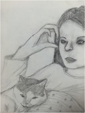
October 17th, 2014
Title: “Sleepyheads” Describe it in a few sentences. This is a pencil drawing of me( I know, it doesn’t look like me) and my cat, Sphinx. I was on my phone and my cat decided to sleep on me so I decided to take pictures. I wanted to draw this because sphinx so cute! How did you use the elements and principles of art? Explain where you include them. I used shading, contrast, and value in the face and clothing, lines in the hair and clothing, pattern in the blanket, movement in the line of the hair and fur, form in the cat and face. Where and when did you do this? I drew this on Saturday and edited it throughout the week. What is the most original or creative part? I think the most original part was the little bonding moment of my cat and I in drawing form. :) Why did you choose this particular theme? I chose this picture because I thought my cat looked really cute in it! What do you like best and what do you like least? Why. I like the hand the best because I it look fairly realistic and I had never been able to draw hands well before. I don’t like my face because it doesn’t look like me and it doesn’t look good either. |
|
|
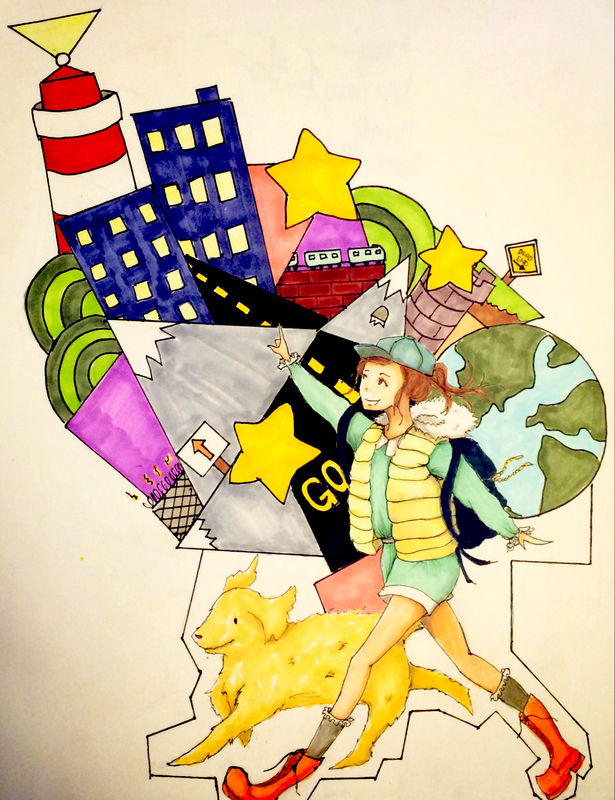
October 24th, 2014
Title: “Escape” Describe it in a few sentences. This is a drawing of a girl and her dog going on an adventure. It’s a fun, colorful and loose piece. I sketched it in first with pencil then outlined it with pen. I colored the drawing with copic markers. How did you use the elements and principles of art? Explain where you include them. I used color, shading and value in the girl and the dog, outlines, texture in the dog, geometric shapes in the things behind the girl, form in the girl and dog, repetition in the yellow rod dash lines and the girl’s vest, and unity with the adventure theme. Where and when did you do this? I drew and colored this at home during the three day weekend. What is the most original or creative part? I think the most creative part was the mixture of random things in the background that adds interest to the piece. Why did you choose this particular theme? I kind of just thought of the outfit and elaborated on that and ended up thinking up this traveling theme. What do you like best and what do you like least? Why. I like the mix of random things behind her because it makes the drawing more interesting and fun. I don’t like how her left boot turned out because it looks like it’s falling off! What else should we know about this piece. The more information you provide, the better! This girl and her dog are running away from home, but their still completely content with their lives because of all of the fun things happening in their adventure(as shown behind the two). |
|
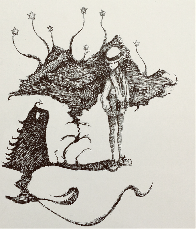
October 31st, 2014
Title: “My Shadow’s Haunting Me” Describe it in a few sentences. This is a ink drawing of a girl and her shadow. It’s sort of like a dream-like drawing with the little cute shadow monster and the big cloud with connecting stars. The girl is looking down at the monster questionly, while it’s trying to get her attention with the big cloud behind her. I sketched it out with pen first then went over with ink. How did you use the elements and principles of art? Explain where you include them. I used contrast in the light and dark of the shadow and the girl, shading and value, movement and rhythm in the lines, pattern in the stars, a bit of balance of the placement of the objects, Where and when did you do this? I drew this last Sunday and shaded over with pen throughout the week. What is the most original or creative part? I think the most creative part was turning the girl’s shadow into a little monster and the big cloud with stars. Why did you choose this particular theme? I wanted to try the pen shading style and I thought this drawing would look cool in black and white. What do you like best and what do you like least? Why. I like the clothing design of the girl the best because it’s unique and kind of retro. I think I could’ve added some background and tried to fill up the page. I also didn't really like the wisps of shadows under because I feel like I could've done more with them. What else should we know about this piece. The more information you provide, the better! This drawing is kind of random and has no real message, but I guess you could look at it as someone looking back at their childhood past. Back then, she could imagine craziest things and her shadow was a friend, but now she’s growing up and heading towards reality. |
|
|
November 7th, 2014
Title: “Bomber Jackets Are Great” Describe it in a few sentences. This is a drawing of an outfit from my clothing that I put together. It’s a maroon bomber jacket with a navy blue and white dress. I hung this outfit on the wall but eliminated the coat hanger. How did you use the elements and principles of art? Explain where you include them. I used shading and value in the clothes, pattern in the striped wall, contrast in the clothes, rhythm and movement in dress, and lines for the creases. Where and when did you do this? I drew this on Saturday at home in my bedroom. What is the most original or creative part? I think the most creative part was the combination of 2 articles of clothing because it’s unique and interesting. Why did you choose this particular theme? I chose this theme because I love my bomber jacket I just had to draw it! What do you like best and what do you like least? Why. I like the bomber jacket because I think it was well shaded but I didn’t like the skirt part as much because I the shading could’ve been better. What else should we know about this piece. The more information you provide, the better! The sleeves of the jacket are black, the main body of the jacket is maroon, the top part of the dress is navy blue and the skirt part is beigeish white. |

|
|
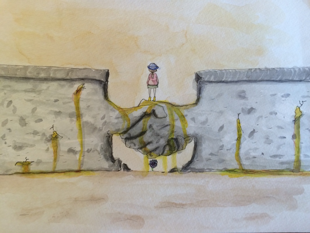
November 21st, 2014
Title: “Tor Auf!” Describe it in a few sentences. This is a watercolor drawing of the fall of the Berlin Wall. The wall forms a handshake that represents the end of the Cold War. The color seeping out of the cracks represent the freedom and unification of East and West Germany. How did you use the elements and principles of art? Explain where you include them. I used color, shading and value on the wall and ground, texture on the walls, contrast in the colors, lines in the outlines, movement in the color, and pattern on the walls. Where and when did you do this? I drew and colored this on Sunday. What is the most original or creative part? I think the most creative part was forming the wall into a handshake. Why did you choose this particular theme? I chose this theme because it was the 25th anniversary of the fall of the Berlin Wall, and I was really interested in. What do you like best and what do you like least? Why. I like the hands the best because they look realistic and creative, but I don’t really like the color dripping out of the cracks as much because it didn’t turn out as good as I thought. What else should we know about this piece. The more information you provide, the better! The little badly drawn/colored flower under the hands is Germany’s national flower, the cornflower. |
|
December 4th, 2014
Title: The Mother of All Chaos Describe it in a few sentences. This is a watercolor painting of a lot of random things. I drew it with pencil first then painted. It’s has a girl, nature, and space things in it. It’s really random and I don’t really know what it is. How did you use the elements and principles of art? Explain where you include them. I used color, contrast in the shading and between the planet and space, value in the mountain thing, emphasis on the girl, movement in the light thing, rhythm in the mountains, and pattern in the buildings. Where and when did you do this? I drew this a couple weeks ago and painted it this week at home. What is the most original or creative part? I think the most creative part was having her cape thing blend into a mountain. Why did you choose this particular theme? I don’t know why I chose it, I just felt like it. What do you like best and what do you like least? Why. I like the mountain the best because it looks pretty good but I don’t really like the light thing coming out and spiraling because it doesn’t really serve a point. What else should we know about this piece. The more information you provide, the better! I guess this could be about mother nature being chaotic and becoming strangled and poisoned by humanity. |

|
------------------PEER CRITIQUES------------------
Emily Frescoln
1. What stands out the most when you first see it?
The long hair.
2. Explain the reason you noticed the thing mentioned in number 1.
The reason I saw the hair first was because it was shaded the most and was the most unique thing about the drawing.
3. How has contrast been used?
The hair is black and shaded while the girl is not shaded.
4. What leads your eye from place to place?
The long hair and hand placement leads my eyes from left to right
5. What tells you about the style used by this artist.
Long and clean lines tell that the artist likes to use more smooth strokes rather than choppy fast-paced sketchy lines.
6. What is something that took you awhile to notice in this composition? Why?
There are small strands of hair and the back of her neck. This took me awhile because I was caught up in looking at the longer parts of the hair.
7. Describe the feelings that are conveyed in this art.
Relaxing and content feelings come from this art.
8. What titles could you give this artwork and why?
Something along the lines of beauty and hair because it’s a really pretty piece of work and the hair is definitely emphasized.
9. What other things interest you about this artwork?
I like how it’s not just the girl facing forward. It’s viewed from her back which is different and interesting. I also like how the hands and arms are placed.
Holla Ferguson
1. What stands out the most when you first see it?
The singer.
2. Explain the reason you noticed the thing mentioned in number 1.
I saw the singer first because she’s higher up than the others and slightly larger.
3. How has contrast been used?
Coloring of the hair and clothing.
4. What leads your eye from place to place?
The people. First from the singer to the redhead, then green haired girl and then to the smallest one.
5. What tells you about the style used by this artist.
She likes to draw anime style because of the way she draws the eyes and not realistic still life like type of work.
6. What is something that took you awhile to notice in this composition? Why?
The poster that says my art because it’s kind of in the corner and is small.
7. Describe the feelings that are conveyed in this art.
Happiness and excitement from their expressions and coloring.
8. What titles could you give this artwork and why?
Concert becuase it looks like their in a concert.
9. What other things interest you about this artwork?
I like the different designs of each person.
Breanna Robinson
1. What stands out the most when you first see it?
The Sony sign.
2. Explain the reason you noticed the thing mentioned in number 1.
I saw this first because it was emphasized by being outlined thickly.
3. How has contrast been used?
The tv screens and small objects are lighter in color than the tv borders and table.
4. What leads your eye from place to place?
The small items on the shelves and the top of the table.
5. What tells you about the style used by this artist.
The small items tell me that she likes to draw longer cleaner lines rather than a sketchy type style.
6. What is something that took you awhile to notice in this composition? Why?
The labels on the small things because they were small writing and blended into the scene
7. Describe the feelings that are conveyed in this art.
8. What titles could you give this artwork and why?
“Living Room Days” or “Human Hibernation”, because it looks like its a room where someone could hole up all day in a winter and have everything they need. Plus, it sets the mood for the oncoming winter and already fall.
9. What other things interest you about this artwork?
I liked how detailed she got into each item and how she even added the labels.
Sophia
1. What stands out the most when you first see it?
The Lamp.
2. Explain the reason you noticed the thing mentioned in number 1.
I saw the lamp first because it stood out from the bushes and clear night sky.
3. How has contrast been used?
The light in the lamp and the darkness in the background.
4. What leads your eye from place to place?
The words lead me from left to right.
5. What tells you about the style used by this artist.
The sky and the bushes tell me that she likes a smoother style.
6. What is something that took you awhile to notice in this composition? Why?
The words on the bush because it was hidden by the texture of the other parts of the bushes.
7. Describe the feelings that are conveyed in this art.
Calm and content.
8. What titles could you give this artwork and why?
The light in the Dark because the lamp stands out in the night.
9. What other things interest you about this artwork?
I like how she incorporated the words along the bushes.
Casey Hinders
1. What stands out the most when you first see it?
The sharpie pen cap and crayon tips.
2. Explain the reason you noticed the thing mentioned in number 1.
I noticed these first because they were colored in bright colors.
3. How has contrast been used?
Shadows of the pen and crayon contrast with the white paper.
4. What leads your eye from place to place?
The pen and crayon keeps my eye centered in the middle.
5. What tells you about the style used by this artist.
the crayon and pen say that she’s very observational and like to detail.
6. What is something that took you awhile to notice in this composition? Why?
The words on the pen and crayon because the words are so small.
7. Describe the feelings that are conveyed in this art.
Brightness.
8. What titles could you give this artwork and why?
School because the objects are school supplies.
9. What other things interest you about this artwork?
I really like the colors of the pen and pencil and red line on the paper. I also like how bright the artwork feels.
Sydney Cosman
1. What stands out the most when you first see it?
The droopiness of the rose.
2. Explain the reason you noticed the thing mentioned in number 1.
I noticed this first because it’s different from just drawing a simple living rose .
3. How has contrast been used?
The inside of the rose is darker than the outside of the petals.
4. What leads your eye from place to place?
From the rose petals down the stem.
5. What tells you about the style used by this artist.
The detail lines shows that she’s very observant.
6. What is something that took you awhile to notice in this composition? Why?
The string attached to the stem because my eyes are mainly focused on the rose petals.
7. Describe the feelings that are conveyed in this art.
I feel some depression from it because the rose is dead and all droopy and crumpled, yet I feel some hope because of the lightness of the shading.
8. What titles could you give this artwork and why?
‘It’s not what you think” because you can tell the rose is dead but it feels like it’s maybe telling you there’s still hope.
9. What other things interest you about this artwork?
I like how she was very creative with the idea.
Callie Flattery
1. What stands out the most when you first see it?
The butterfly.
2. Explain the reason you noticed the thing mentioned in number 1.
It was shaded the darkest so it contrasts with the other.
3. How has contrast been used?
Contrast from the butterfly to the hands because its dark to light.
4. What leads your eye from place to place?
The vines and branches lead up to the hands which leads up to the butterfly.
5. What tells you about the style used by this artist.
Surrealist really pretty artwork!
6. What is something that took you awhile to notice in this composition? Why?
The hands morph into branches and vines because I was paying more attention to the butterfly than the bottom part of the page.
7. Describe the feelings that are conveyed in this art.
nature, freedom, happiness, light
8. What titles could you give this artwork and why?
Something about nature because it has tree branches and vines and a butterfly!
9. What other things interest you about this artwork?
I really like the surrealism of the piece.
Peter
1. What stands out the most when you first see it?
The different shading techniques.
2. Explain the reason you noticed the thing mentioned in number 1.
I noticed these first because it adds a lot of interest to the work.
3. How has contrast been used?
Intense shading in the hand.
4. What leads your eye from place to place?
My eyes go from the fingers to the lower arm.
5. What tells you about the style used by this artist.
This person likes to use a lot of different shading techniques.
6. What is something that took you awhile to notice in this composition? Why?
The line right below the wrist because I was focusing on the hand more than the arm/wrist.
7. Describe the feelings that are conveyed in this art.
Intensity and contrast.
8. What titles could you give this artwork and why?
I actually don’t know, maybe like ‘Rough Days’ because the hand looks pretty rough and likea hard worker’s hands.
9. What other things interest you about this artwork?
I really like how he used a black sharpie to shade it because it makes the piece even more interesting.
Isaac
1. What stands out the most when you first see it?
The cabinet.
2. Explain the reason you noticed the thing mentioned in number 1.
Because it’s large and in the center.
3. How has contrast been used?
Contrast has been used in the shading and values of the objects like the vases and the frame.
4. What leads your eye from place to place?
The cabinet keeps my eyes on the center and then the objects on the cabinet draws my eyes up.
5. What tells you about the style used by this artist.
This person likes to draw realistic objects with light shading.
6. What is something that took you awhile to notice in this composition? Why?
The two bars at the bottom of the page because it kind of blends into the dark background.
7. Describe the feelings that are conveyed in this art.
Organization and calmness.
8. What titles could you give this artwork and why?
Organization because it looks very organized.
9. What other things interest you about this artwork?
I like how he uses different textures and lines on the cabinets.
Martin Barajas
1. What stands out the most when you first see it?
The yellow face.
2. Explain the reason you noticed the thing mentioned in number 1.
I noticed the yellow first because it’s very bright compared to the other colors.
3. How has contrast been used?
Contrast has been used in the different colors. White for the eyes and black outlining.
4. What leads your eye from place to place?
The face keeps my eyes in the center.
5. What tells you about the style used by this artist.
This person likes to color with marker and color solidly.
6. What is something that took you awhile to notice in this composition? Why?
The blue earring because it’s kind of blended in with the black hair since the earring is dark blue.
7. Describe the feelings that are conveyed in this art.
happy, rebellious, energetic.
8. What titles could you give this artwork and why?
“Planning Something” because he looks like he’s going to pull a prank on someone.
9. What other things interest you about this artwork?
I like how he drew Cristiano Rolando into the simpsons style.
Sofia Guana
1. What stands out the most when you first see it?
The skull.
2. Explain the reason you noticed the thing mentioned in number 1.
I noticed this because it was in the center of the perfume bottle and was detailed.
3. How has contrast been used?
The
4. What leads your eye from place to place?
The perfume bottle keeps my eyes in the center.
5. What tells you about the style used by this artist.
This person likes to use clean and precise lines.
6. What is something that took you awhile to notice in this composition? Why?
The small detail lines on the top of the bottle because they were lightly drawn on.
7. Describe the feelings that are conveyed in this art.
Being pretty!
8. What titles could you give this artwork and why?
Perfume because there’s a perfume bottle.
9. What other things interest you about this artwork?
I like the design and detail put into the perfume bottle.
Earl
1. What stands out the most when you first see it?
The basketball.
2. Explain the reason you noticed the thing mentioned in number 1.
It was the most shaded and most emphasized.
3. How has contrast been used?
Dark and light shading in the basketball.
4. What leads your eye from place to place?
The basketball draws my eyes to the center, and then down to the stool.
5. What tells you about the style used by this artist.
This person shades and draws lines cleanly and smoothly.
6. What is something that took you awhile to notice in this composition? Why?
This stool because it was not in the center and not as emphasized as the basketball.
7. Describe the feelings that are conveyed in this art.
Calm and relaxed.
8. What titles could you give this artwork and why?
Basketball because there’s a basketball!
9. What other things interest you about this artwork?
I really like how clean the shading is and how detailed it was.
Luke
1. What stands out the most when you first see it?
The mustache on the head.
2. Explain the reason you noticed the thing mentioned in number 1.
I saw the mustache first because it was in the center and emphasized in size.
3. How has contrast been used?
The face had shading to add form, and this made dark and light spots.
4. What leads your eye from place to place?
The big head keeps my eyes in the center of the paper.
5. What tells you about the style used by this artist.
This person likes to draw abstract pieces.
6. What is something that took you awhile to notice in this composition? Why?
The little hat on top of the head because it’s so small!
7. Describe the feelings that are conveyed in this art.
Craziness and fun.
8. What titles could you give this artwork and why?
“Egghead” because the head looks like a freaked out egg.
9. What other things interest you about this artwork?
I really like how abstract and random this piece is. I also liked the shading of the head.
